1. Let's start with a fairly well-known example. In 2019, Google decided to move away from boring faceless boxes for its equipment and sent the Pixel 4 to bloggers for review in a package designed for a Domino's pizza box. The design is appropriate: they promise us a "top filling" and tell us about some of the functions.
2. Sock Packaging Designers Hellotex, inspired by the paintings of famous artists, made sure that the packaging worked on the overall concept. So, instead of a boring cardboard, socks were placed in a frame. It is much more pleasant to receive such socks as a gift than an ordinary pair. But not everyone is likely to want to use them for their intended purpose.
3. Another work by the same designers, but for the Color Eat project. These are sets of natural jams designed to match the palette for paints. First of all, such packaging is designed for children: the creators wanted to turn the usual part of breakfast into a fun game. And she also beckons to mix flavors: what's not a reason to experiment and add variety to familiar recipes?
4. Conceptcoffee packaging "Workaholic" from the Moscow creative agency The Clients. From the description of the project:
While designing the packaging for a coffee drink in a wine bottle, we realized that a real workaholic is someone who can never stop. That's why we created 10 logos instead of one, 10 labels instead of one, as well as a gift box, beer cans, coffee packs, bonfires, stickers, badges, wrapping paper, a flask, patches, posters and a sticker pack for Telegram.
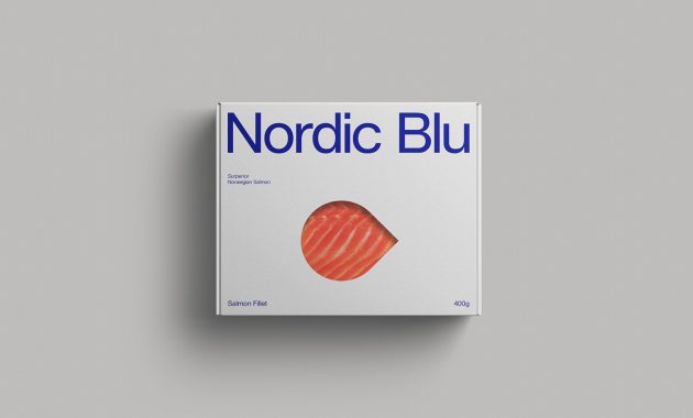
5. From redundancy to simplicity: This is what the packaging of the famous Norwegian salmon Nordic Blu looks like. Sometimes it's worth letting the product sell itself.

6. The packaging of Naked intimate hygiene products resembles the skin on the human body in color and unusual complex shape. She even blushes when touched because of the special thermochromic paint.
7. Butter Portion Oil! Better! uses a small wooden knife instead of a lid — because such oil is most often taken on picnics or a quick snack, and few people carry cutlery with them.
8. The packaging of milk Molocow is in every sense out of this world.
9. A story where the product and packaging are intertwined into one: sweet candies in the form of stones on sugar "sand", which can be used as a rock garden. It's a pity that this dessert never went on sale — but in Japan sets with a similar idea are on sale.
10. Design San Remo spaghetti packaging with a measuring mechanism that allows you to get the optimal portion of pasta.