It seems that at last year's redesign of YouTube, the service team did not calm down: now the video viewing page is waiting for changes, which has not changed significantly for several years.
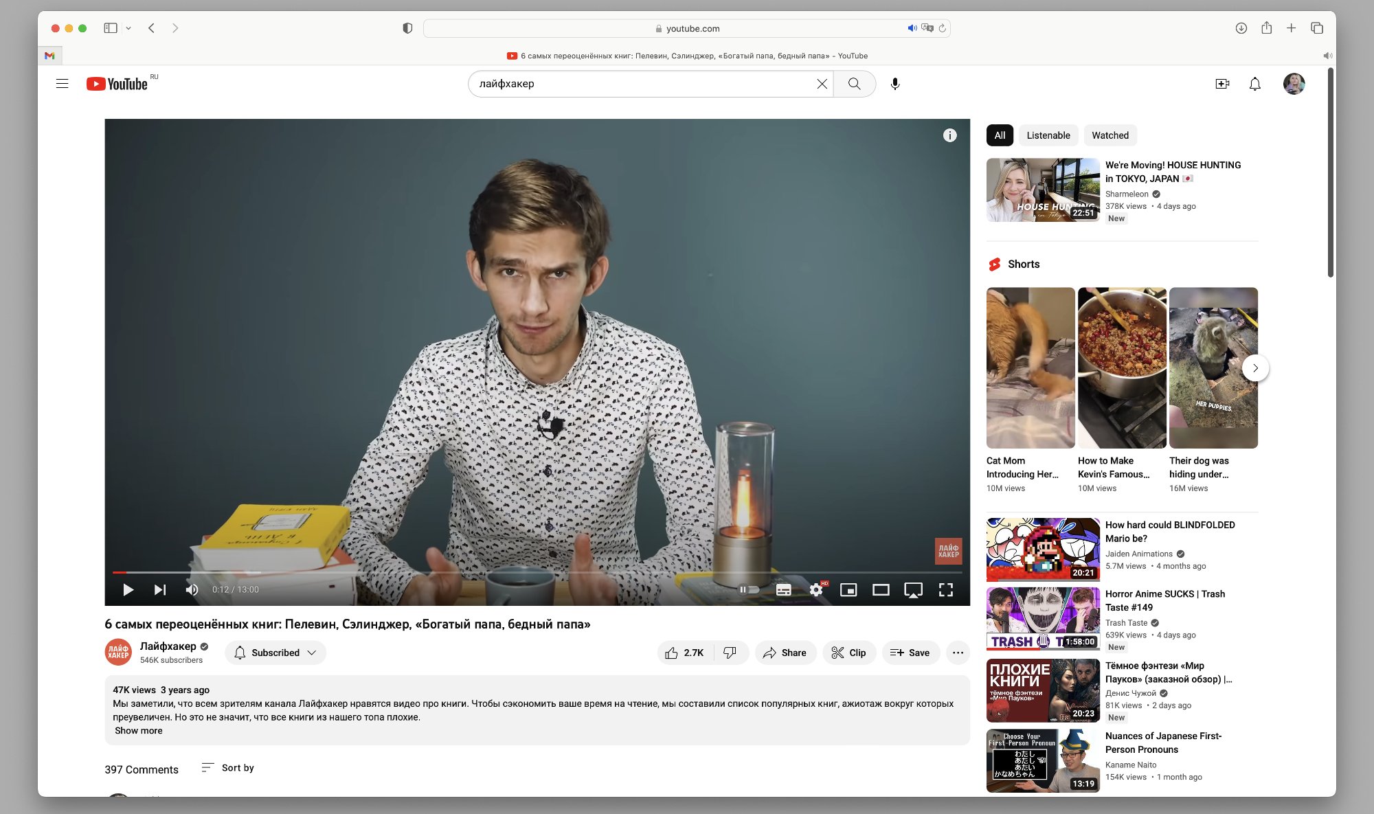
Now, when watching videos in a standard player, the video description, channel statistics and the number of likes and comments are under the video. Recommended videos and Shorts are located in the feed on the right side.
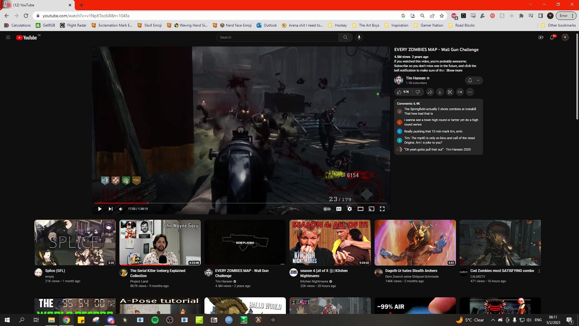
The new design, which some users have started to see, has changed the location of the blocks in places: now the information about the video and comments are on the right, and the recommended videos go below with larger previews.
Here's what the actual design looks like:

And that's it — redesign:

The example with the new design shows that the interface has not yet been completed. For example, there is a large gap between the comments panel and the recommendations list. Perhaps there will be some other block in this place - for example, an advertising one. It is also possible that the comments panel will simply be stretched by the final release.
So far, it is impossible to switch to a new design: it randomly appears to users from different countries and disappears after the page is updated. Perhaps it will be officially presented and will start rolling out to everyone already at Google I/O , which starts on May 10.