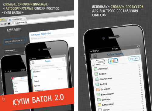
Lifehacker has already sung an ode to the minimalist shopping list "Buy a loaf!". The smart app faithfully and quickly fulfills its main task: you spend less time on purchases and do not forget to buy anything (if you did not forget to add it to the list).
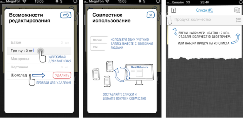
The neat interface pleases the eye, and the possibility of "cloud" synchronization between devices allows you to hike through giant supermarkets with friends. Running into different departments, you buy products, crossing them out of the general list. The time spent on making purchases is reduced significantly.
Products can also be added to the list using the web interface of the application. By visiting the site, for example, your significant other adds products to the list, and "Buy a loaf!" informs you about the changes with a notification on the phone's home screen.
<!-rss-cut—>

The "Buy a loaf!" application has already found a lot of fans and rightfully holds the first place in the "Productivity" category of the Russian AppStore.
For the New Year holidays, the developers of "Buy a loaf", the Script company, have prepared a new version of the application: "Buy a loaf! 2.0». At first glance, there is only one new thing in it — the possibility of splitting products into categories has appeared. It was this feature that many active buyers lacked so much.
But there is also something that you cannot see with the naked eye, but you can feel: the developers have completely rewritten and rechecked the application code, cleaning out a considerable number of minor bugs. Now the application works more stable and faster. Added the ability to disable automatic synchronization in the settings — a useful feature if you use "Buy a loaf" alone from your phone.
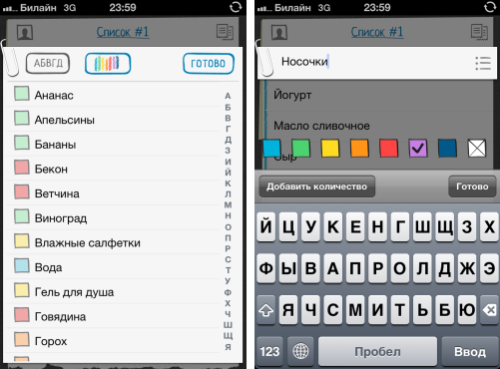
Now let's take a closer look at how the issue of sorting products by category has been resolved. This is done in the same spirit of simplicity and grace inherent in this application. Products are divided into categories by color. That is, let's say dairy products are marked blue, meat products are marked red, vegetables are green, etc. The developers have already broken down some products by color, but you can change them as you wish.

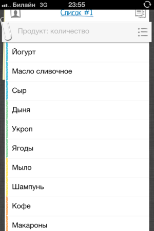
And here's what the color breakdown in your shopping list will look like:

Do you see the multicolored stripe to the left of the list? This is sorting. Now it's much easier to navigate the shopping list. In order to further simplify and speed up your trips to supermarkets, the products in the list can be placed in such an order that those that are located at the entrance to the store go first, and at the end — those that are sold near the cash register. You will need to go around the store only once, checking the list along the way. This technique will allow you to avoid chaotic movements and impulsive, unplanned purchases.
A small personal life hack: I use "Buy a loaf!" not only as a shopping list, but also as a to-do list for the day. Such an application is suitable for me, not overloaded with unnecessary elements, and crossing out the things done is a real pleasure. However, it seems that not only I came up with this way of using this application.
Have a good and fast shopping with the new version of the app "Buy a loaf 2.0"!
The new "Buy a loaf!" is already in the App Store

UPD. The developers have provided readers of Lifehacker with 10 promo codes, which are attached in the comments to this post.