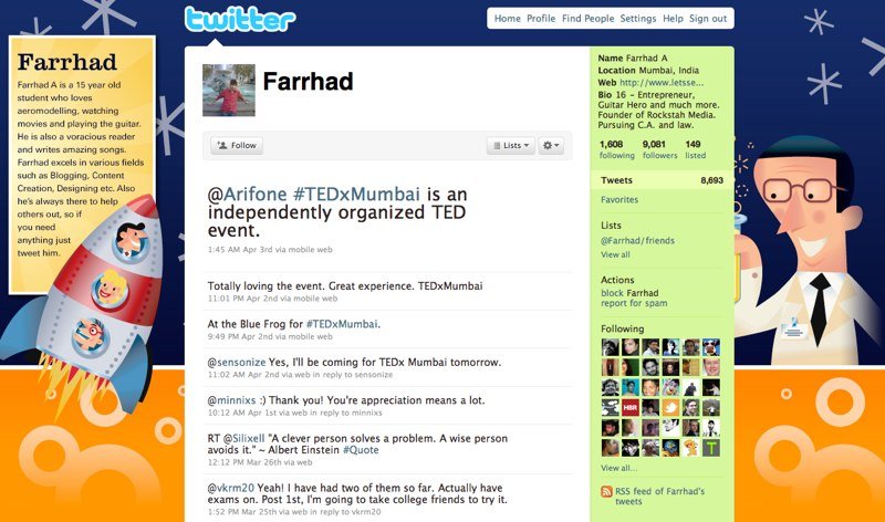
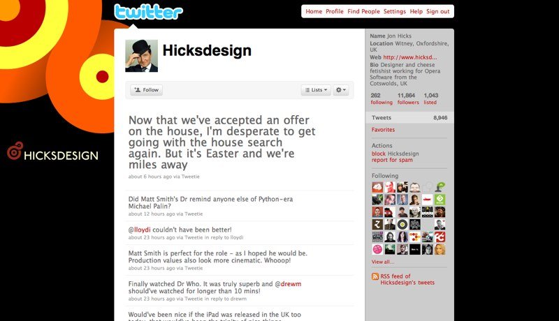
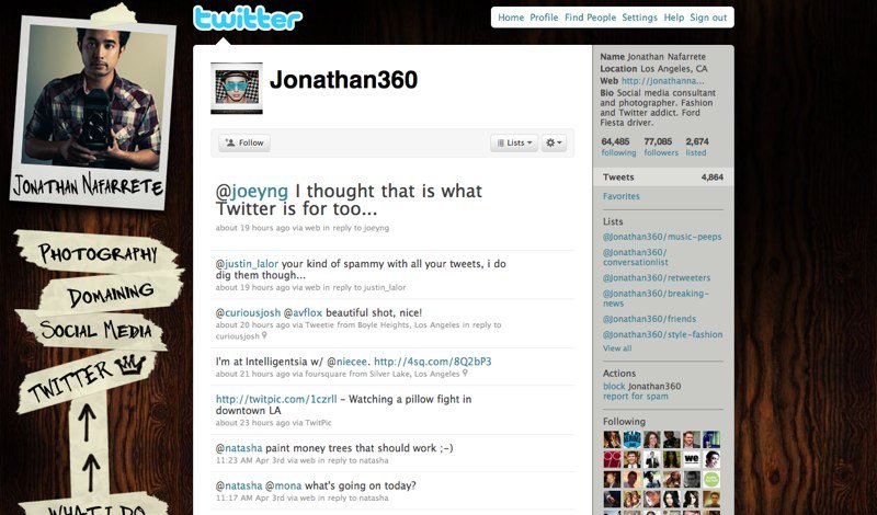
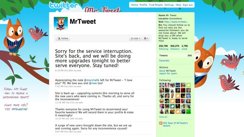
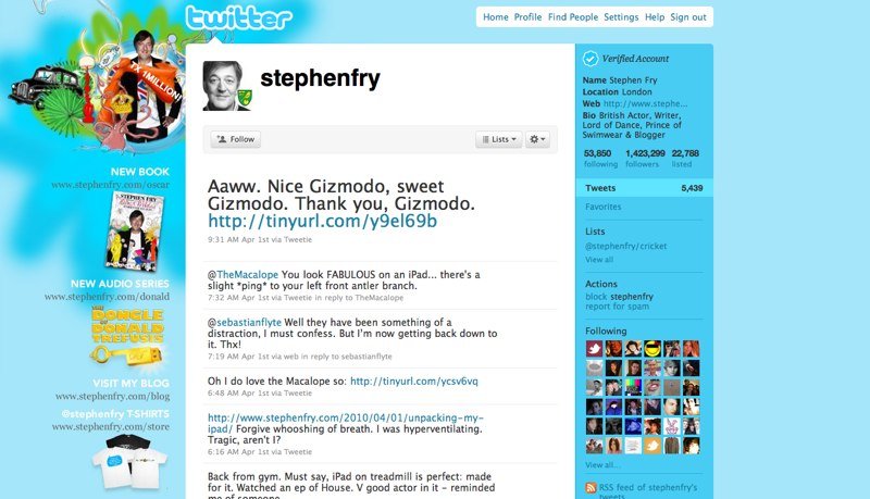
There is nothing more strange for a Twitter user than a standard avatar and a standard personal account design. Why not take advantage of these opportunities to increase the sympathy of potential followers for you?
You can use both paid photoshop and free editors like GIMP or online Picnik or Aviary's Phoenix to work with graphics.
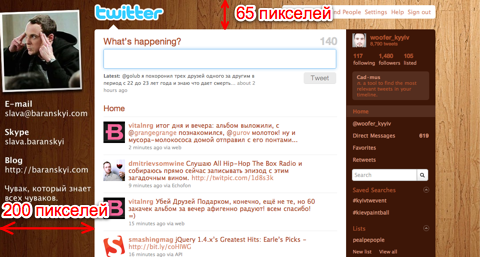
Requirements: the size of the drawing should not exceed 800 KB. The main information area where you should put your photo and other information is on the left — do not make it more than 200 pixels. That's because the width of the Twitter information feed is 760 pixels: 760 + 200 = 860 — so you tried for the poor devils who have a screen resolution of 1024×768. They will also see your information on the left and read the Twitter feed.
Further, after the 200 pixel block, you can draw abstractions of any type, but just remember that if the user has a large monitor with a resolution of 1680x... or 1920x..., then the browser will multiply your background and you will appear again on the right with your information. Therefore, make a picture with a width of at least 1680 pixels.
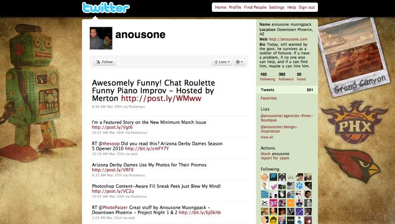
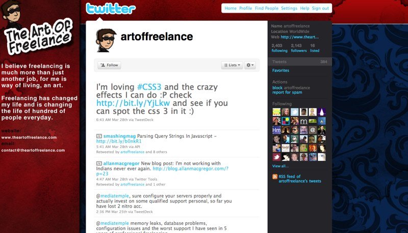
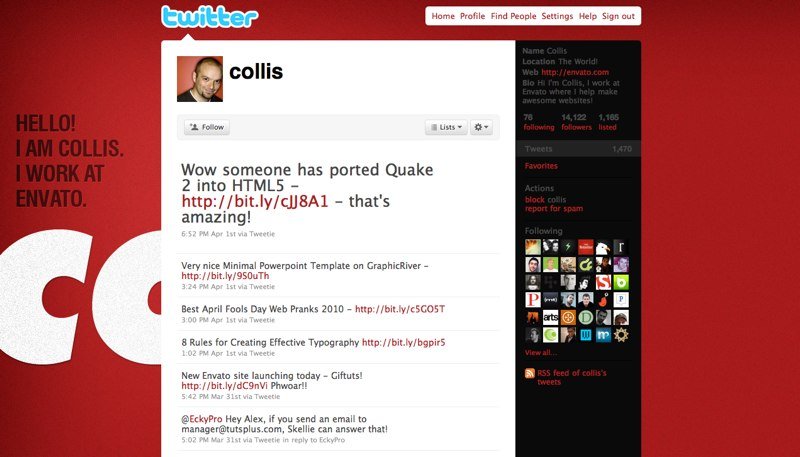
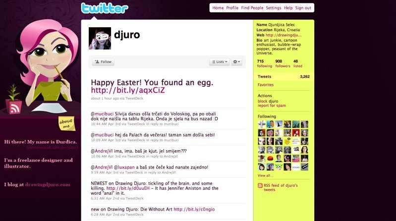
Below we offer you beautiful examples of successful design of personal tweeters:
