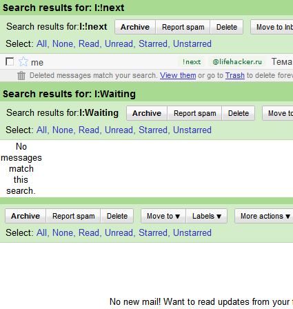
If you follow how Gmail is developing, you couldn't help but notice that Gmail Labs recently gave us the opportunity to have several inbox panels on the Gmail homepage. This can be convenient if you collect mail from multiple addresses. But who prevents us from using this opportunity to install a GTD system, which can be implemented in Gmail in various ways.
For example, these new additional panels seem to be the most suitable ways for me to embody GTD. Why?
I'll explain. To ensure maximum performance, you need to isolate yourself from unnecessary information, and therefore you should see only what is necessary on the screen. It is obvious to me that I would like to see a list of the following cases all the time, a list of what I expect (so as not to miss the necessary reminders) and the inbox itself for parsing. That's why my GTD installation will look like three panels:

When planning, I switch to projects and contexts, which are represented by labels starting with # and @, respectively. That's where I mark the following actions with a label «!next».
Tasks that depend on someone else to complete are labeled Waiting. And I see them immediately when I look at the central Gmail page. It is to facilitate the determination of my next actions that I have made the lists «!next» and «waiting » are higher than Inbox itself, thereby emphasizing the need to focus on current tasks first.
However, my method may seem inconvenient to you, since you are using something of your own. Share your experience in the comments.