The designer under the nickname AR 4789 showed a new video concept of an alternative operating system. Previously, he had already created the "perfect" Windows Utopia, but now he visualized something more mundane and really preparing for release: Windows 12.
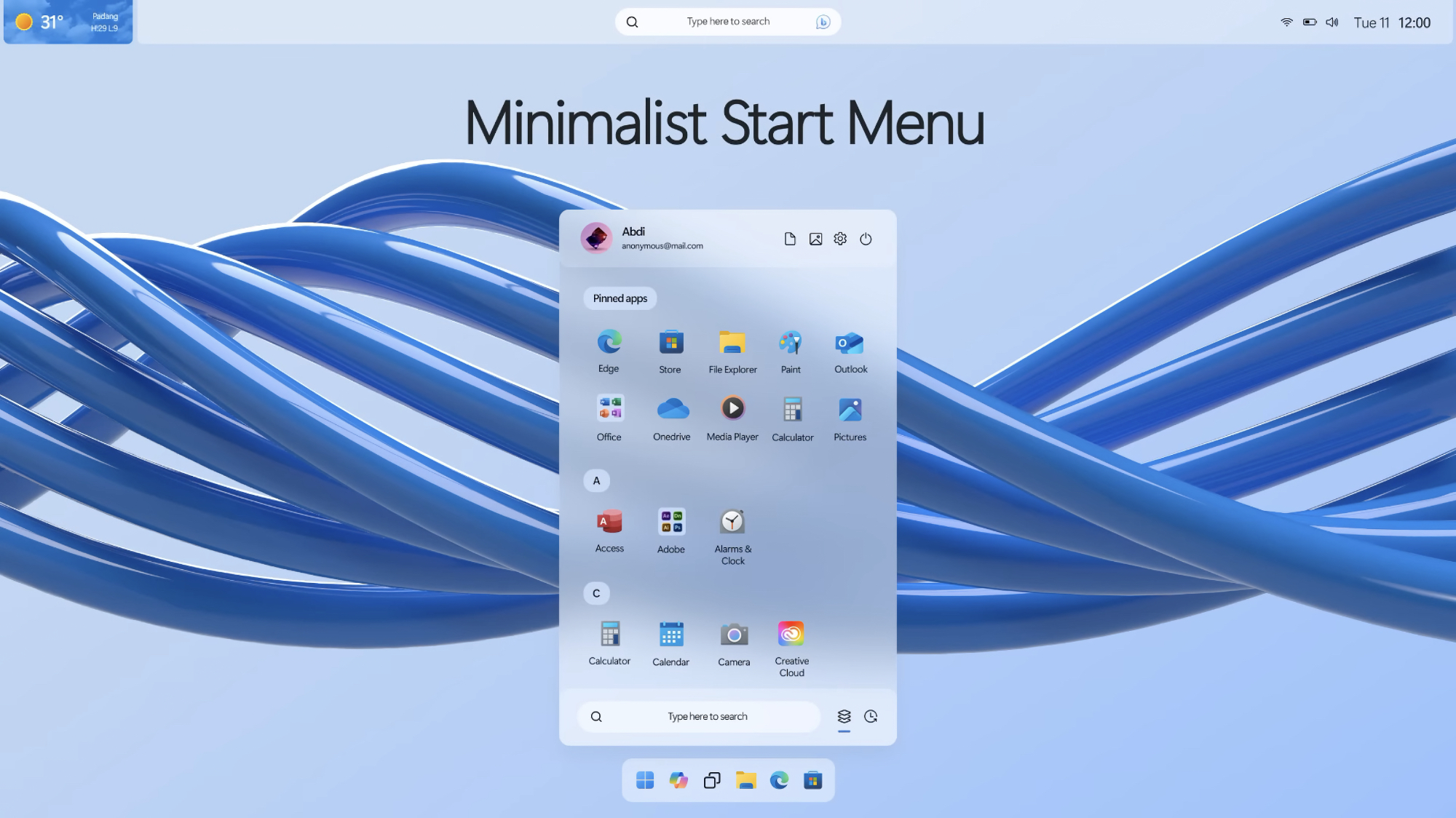
The video he created is a promo that begins with a retrospective of old versions of Windows and gradually reaches the new Windows 12. The main visual changes are that the interface elements have become rounded and translucent, due to which they adapt better to the background. The search box, time and important icons have moved to the top — in the style of macOS. Only the icons for quick access to favorite applications and the Start menu were left on the bottom panel.

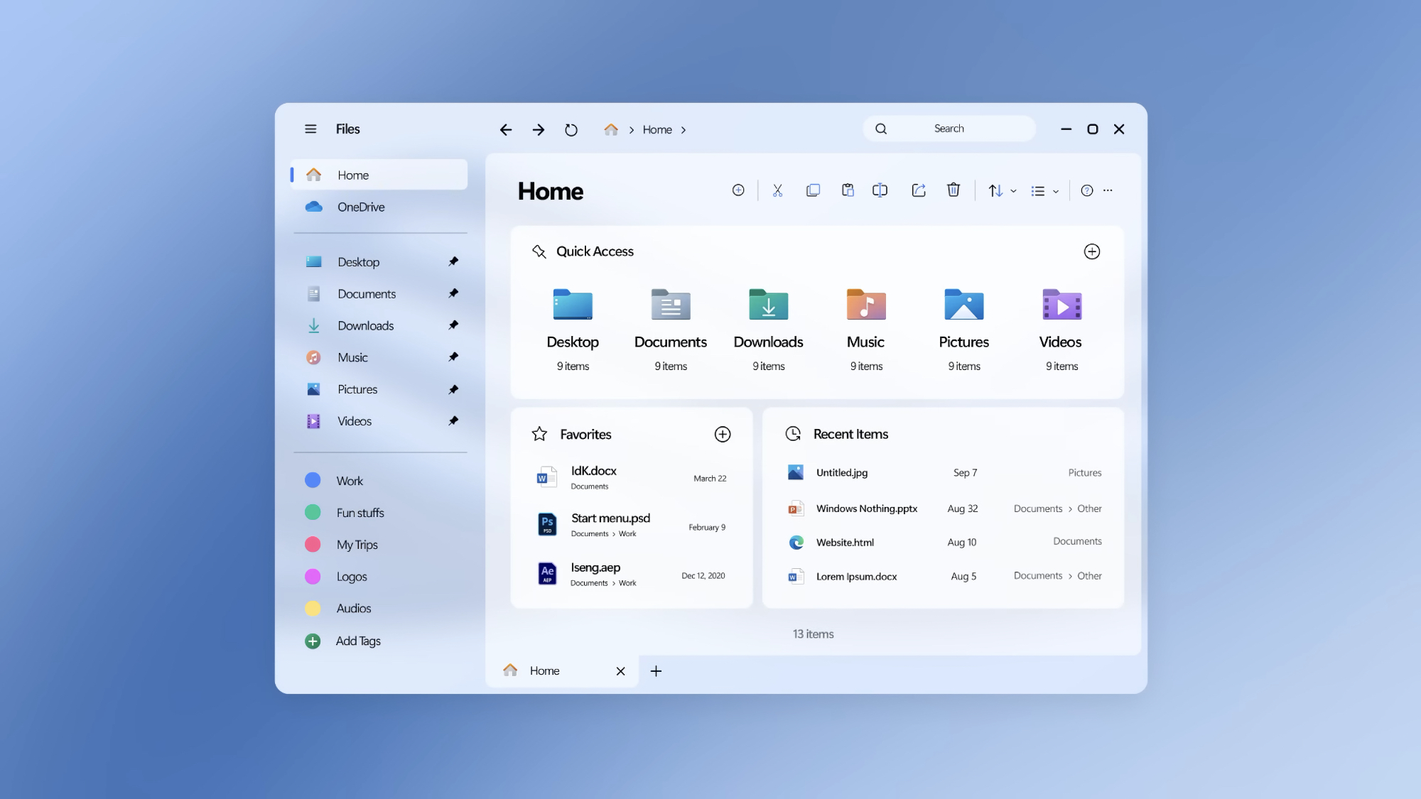
The standard Explorer application has also received a redesign:

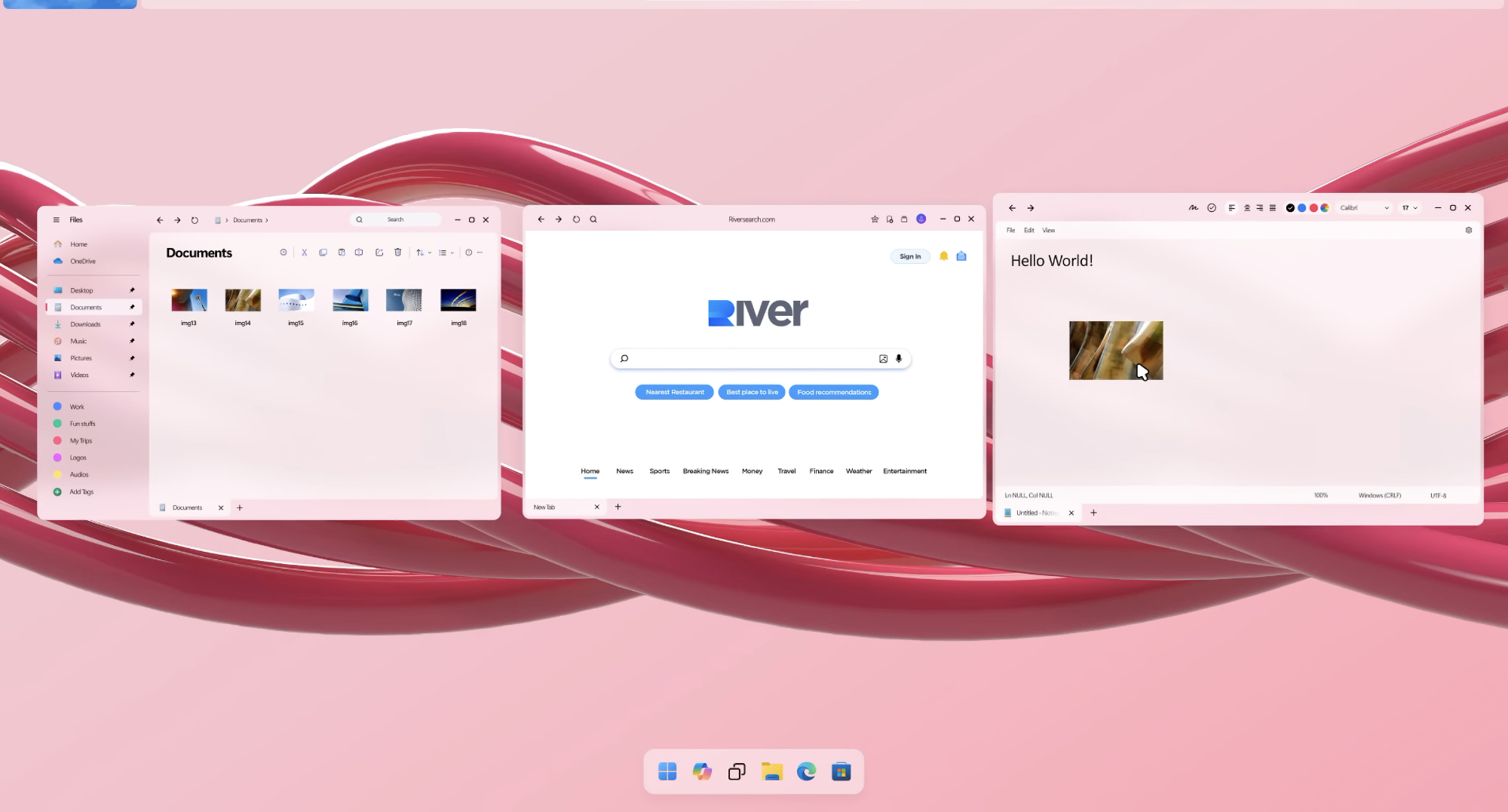
Dragging files between applications has become more convenient. It is enough to pull the desired file in the "Explorer". All open windows will be grouped so that you can immediately see which one you need — for example, a browser or Paint.

The settings section has become personalized: the main page offers the sections with which the user interacts most often.

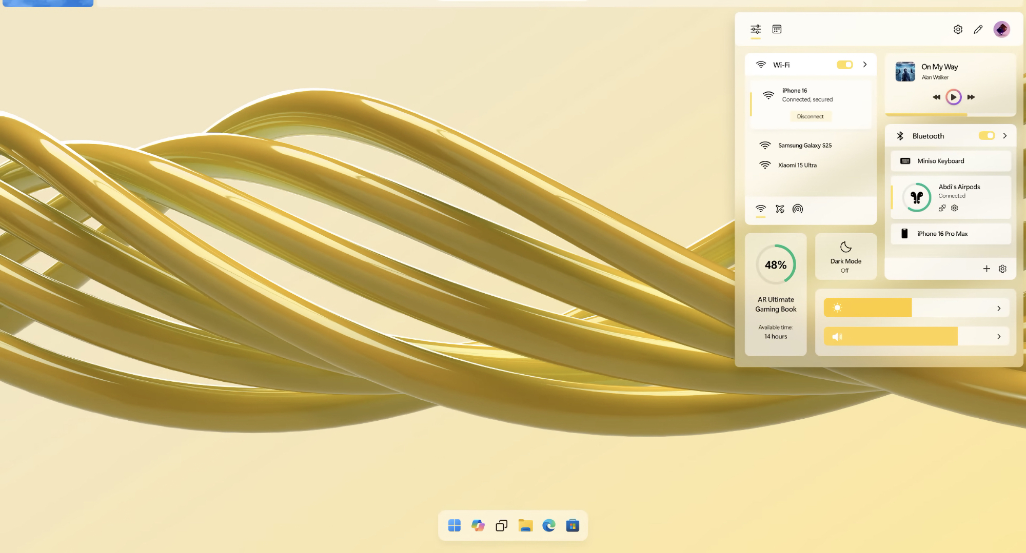
The quick settings menu was generally copied from iOS — but slightly redesigned to avoid litigation.

Other features include creating unique wallpapers using AI with the ability to install them on your desktop in one click, widgets that can be placed anywhere on the screen and adjusting the interface colors to the wallpaper (this was apparently spied on in Android 12).
How do you like this Windows 12? Would you like to use such a system, or is it not to your taste? Tell us in the comments!