
Since its introduction in 2009, Reeder has captured the attention of a huge number of users, and very deservedly, because it had every chance to become a leader in the RSS reader segment. Independent developer Silvio Ricci from Switzerland put his soul into his brainchild, and Reeder from the iPhone application, grew up to the iPad version, and then came to the Mac.
The application has become a truly indispensable tool for many people: from ordinary users who wanted to read their news without being distracted by advertising and garbage, to journalists who passed the incoming information flow through Reeder, choosing the most important thing.
But after closing Google Reader, everything changed — the developer left only the iPhone version of the application, adding Feedly and Feed Wrangler support to it. The iPad and Mac versions were also released from the App Store. Without cross-platform synchronization, Reeder ceased to be a universal tool, and many users switched to alternative RSS readers.
And now, Reeder is finally back! With iOS 7 support. With a new interface and design. Well, let's take a look at what Silvio Ricci has been working on for so long, and evaluate his work.
* * *
According to the developer, he did not just update Reeder, but created a new application from scratch. That is why you will have to pay $5 for it, but this time at least you do not need to separately buy the version for iPad — Reeder 2 universal iOS app.
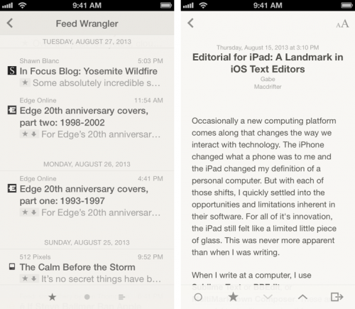
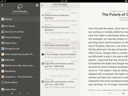
Following the philosophy of anti-skewomorphism, which permeates the design of iOS 7, Silvio removed all imitations of skin and paper textures from the interface. Now the design of the application has become even more minimalistic — absolutely nothing distracts us from reading. Thanks to the changed color scheme and a flatter interface, reading has become much easier. Due to the fact that we focus exclusively on the text of the article, it gives the impression of reading a paper edition. This is exactly what we fell in love with Reeder for.
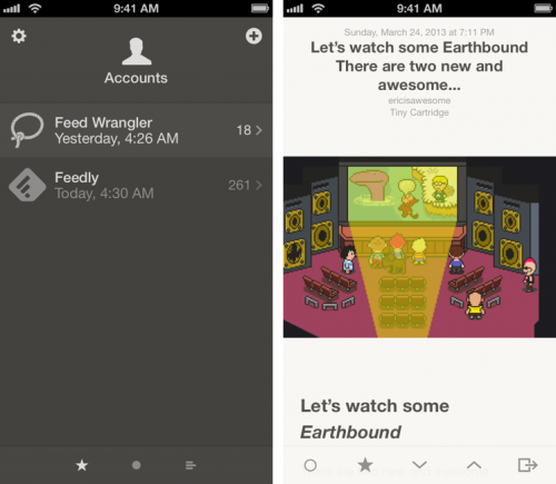
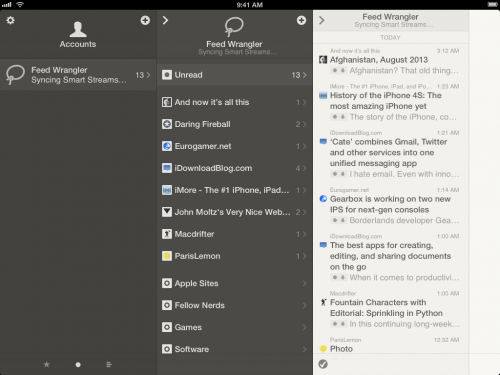
The application can collect content from such services as Feedly, Feedbin, Fever, Feed Wrangler, Readability. Well, the usual RSS, where without it, however, in this case you will have to forget about synchronization between devices. Although, by and large, many would have enough support for Feedly alone. Also, importantly, it is possible to work with multiple accounts.
You can share interesting materials using multiple sharing services, such as: QUTE.fm , Buffer, Readability, Instapaper, Pocket, Evernote, Pinboard, Zootool, Delicious, App.net , Twitter, Facebook*, Messages, Mail. The sharing panel is fully customizable, you can select only those services that you need and remove unnecessary ones.
In the old version of the program, intuitive gestures were actively used to control. Now there are noticeably more of them, here is the full list of supported gestures:
Using gestures speeds up your interaction with the app and takes usability to a new level.
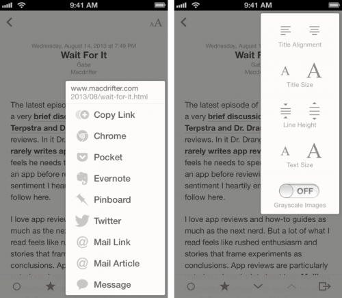
Text display settings have received a large number of options. Here you can change not only the font size (as before), but also its alignment and line spacing. Here, an interesting function is included «Grayscale Image», which discolors all the pictures so that they distract us less from the reading process.
Actually, this is where all the key features of Reeder 2 end. And despite the updated interface and new design in the style of iOS 7, the application leaves behind an ambiguous opinion. On the one hand, the update is great and the developer has done a lot of work, but on the other hand, the price of Reeder 2 is great, as much as $ 5. In principle, such a price tag for a high-quality application justifies itself, but we have already paid for it once, haven't we?
Do you think, dear readers, is Reeder 2 worth buying it again?
Instagram Facebook and social networks owned by Meta Platforms Inc. are prohibited from operating in the territory of the Russian Federation.
*