Nathan Yau, author FlowingData.com , collected open tracks from RunKeeper and used R to write code overlaying these tracks on city maps. I generally like all sorts of visualizations, and not only is there a beautiful picture, but also about running, and everything is done on R. I couldn't pass by in any way.
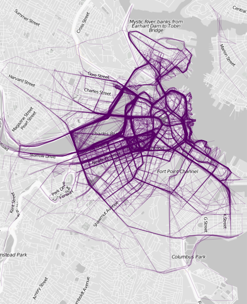
It is always interesting to analyze tracks after jogging, most often we watch our activities or friends, but if we collect data from thousands of users, we will get a very entertaining picture. You can understand which routes are popular among other runners, this can be useful if you are traveling to some new city. For example, this is the data for my favorite "running" city — Boston:
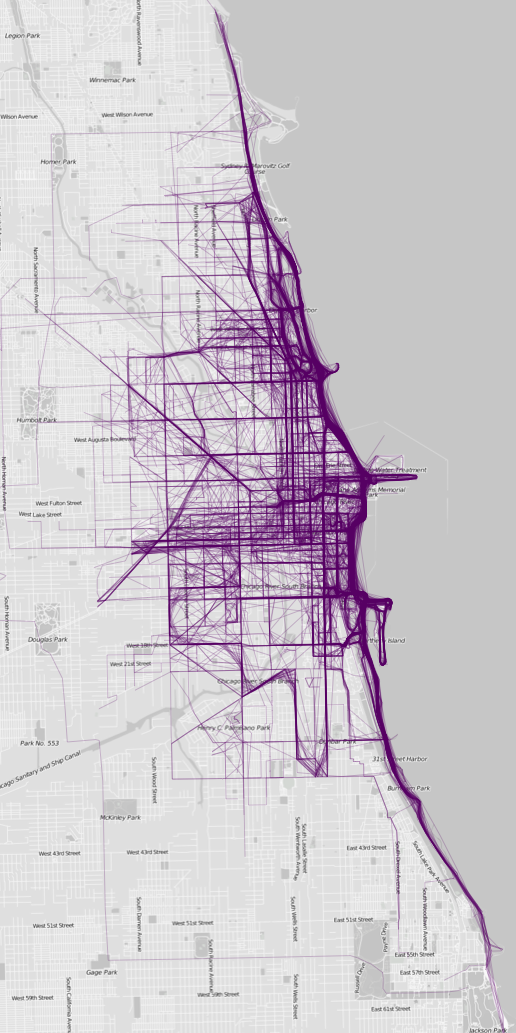
And this is Chicago. The Lake Michigan waterfront is popular:
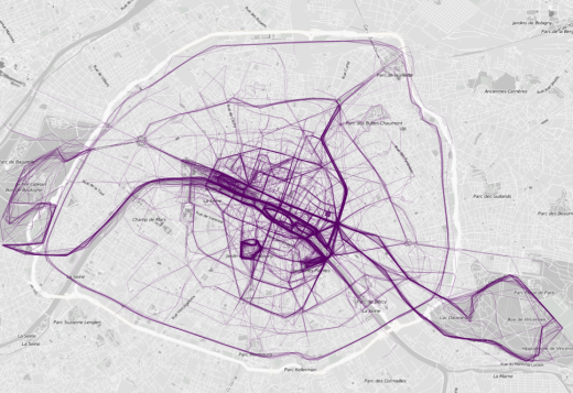
And Paris, where without him on the eve of February 14:
There are several other cities in the gallery, the most interesting, as it seems to me, of them is Sydney, similar to the hand:
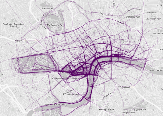
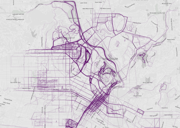
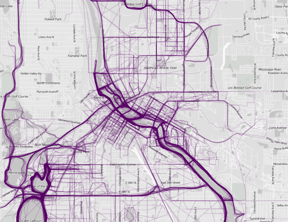
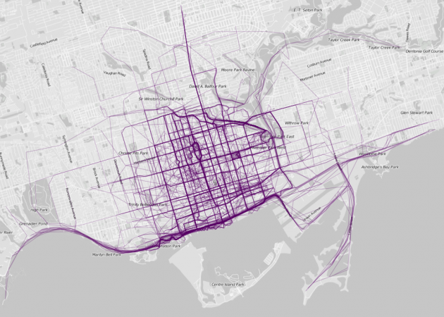

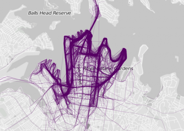
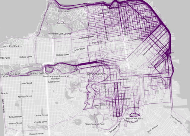
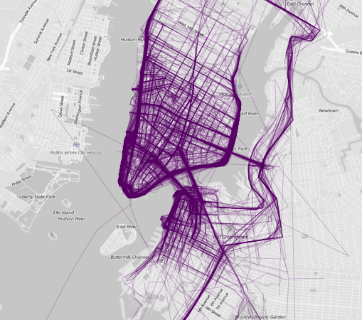
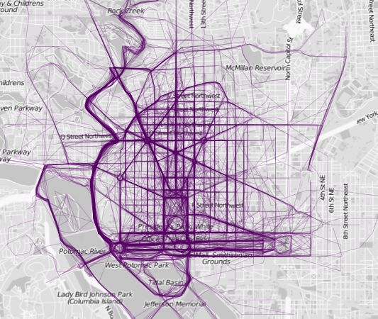
If you look at all these maps, it is noticeable that people like to run along rivers and other bodies of water, although everyone knows it anyway :)
Nathan posted a script in R on his blog, with which you can quickly visualize your (and not only) runs by simply downloading them all from RunKeeper or another service that supports export in GPX format.
(via)