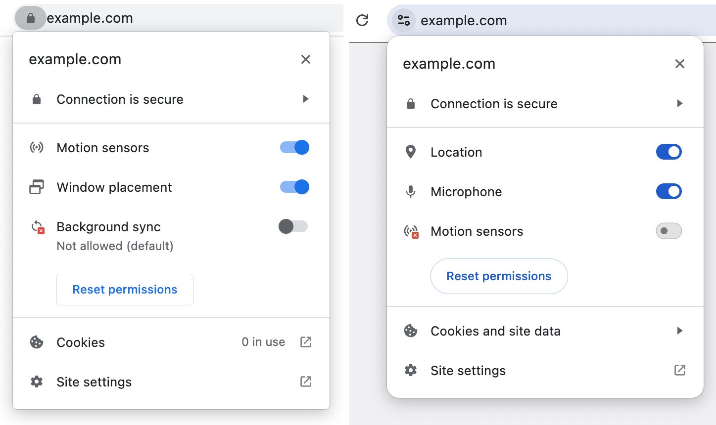
As part of the next redesign of Chrome, the browser will lose a popular visual element that users often interpret incorrectly: a lock in the address bar of HTTPS pages.
Browsers have displayed such an icon since the days of Netscape in the 90s. At that time, the HTTPS protocol was a rarity, and it was important to highlight the advantages that it provided for user security. But now about 95% of the pages that are opened in Chrome on Windows use HTTPS. With this in mind, it's time to change how the browser and users evaluate security.
Moreover, an icon in the form of a lock can increase the credibility of a site that does not deserve it. Despite Google's efforts to explain that the icon only shows compliance with the minimum data protection requirements, users usually do not delve into this. The 2021 survey showed that only 11% understand what this icon is, and organizations like the FBI even had to issue warnings that the lock icon does not mean the security of the site.

In the Chrome 117 update, which will be released in early September, the lock icon for HTTPS pages will be replaced with an icon in the form of two switches. It does not imply trust in the site and is more often associated with settings, so it will be clearer to the user that you can click on it. Sites with the HTTP protocol will continue to be marked as unsafe.